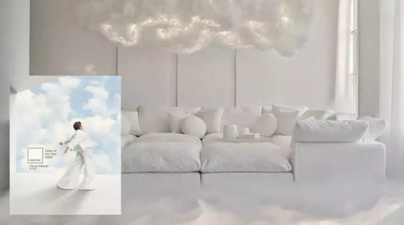
In a move that has taken industry watchers by surprise, the Pantone Color Institute has announced its Colour of the Year for 2026. Defying widespread forecasts for a warm neutral or a green shade, the institute has chosen a hushed, soft white named 'Cloud Dancer' (PANTONE 11-4201). The announcement was made on Thursday, marking the first time in the program's history that a shade of white has received the annual honour.
A Cosmic Reset: Decoding Cloud Dancer's Quiet Message
Pantone describes Cloud Dancer as a lofty, billowy white that symbolizes a calming influence. It represents a society rediscovering the value of quiet reflection. Laurie Pressman, Vice President of the Pantone Color Institute, stated that this airy hue exemplifies our collective search for balance between a digital future and the primal need for human connection.
Indian design and fashion experts were quick to share their interpretations. For Delhi-based fashion designer Achint Mehta, the choice is profound. He calls Cloud Dancer "a cosmic reset button", a reminder that after years of visual chaos, the boldest statement can be a clean slate. Luxury expert Niti Gupta sees it as a dreamy, cosy white with a gentle warmth, moving away from stark, icy tones.

Fashion designer Mehakk Jain believes the shade hints at a cultural shift towards simplicity and emotional lightness, inviting people to slow down and declutter. Celebrity stylist Madhuri Singh notes it signals fashion's continued tilt towards minimalism and the 'quiet luxury' trend, even influencing bridal wear where heavy opulence is being replaced by neutral palettes.
Social Media Buzz and Competing Colour Forecasts
Reaction on social media has been mixed. While many appreciate the calm and minimalism Cloud Dancer promotes, others find it underwhelming, with some critics labeling it as "design inertia" for those craving bold creativity in 2026.
This surprise pick stands in contrast to forecasts from other major brands for the same year, which largely reinforce predicted trends:
- Valspar has chosen Warm Eucalyptus, a serene, earthy green.
- WGSN and Coloro selected Transformative Teal, a balanced blue-green.
- Sherwin-Williams picked Universal Khaki, a versatile tan.
- Krylon opted for Matte Coffee Bean, a moody dark brown.
What Pantone's Choice Means for 2026 Trends
Despite the surprise, industry experts still see strong directions emerging for 2026. The year is expected to be dominated by richer, warmer neutrals, with Achint Mehta predicting the rise of "Digital Coral"—a warm, impulsive tone. Expect a focus on mood-anchoring shades like warm grey, brown, ivory, and merlot.
Earthy, grounded colours will create stable and nurturing interiors. Think chalky rose, smoky blue, tobacco brown, dusty olive, and sunbaked terracotta. Furthermore, green is cementing its status as a new universal neutral. Monica Wahla, head of women’s buying at JD Williams, told Forbes that olive green has already taken over as the versatile neutral, a trend multiple brands are embracing for their 2026 palettes.
In essence, Pantone's Cloud Dancer is not just a colour but a statement. As interior designer Punam Kalra puts it, in a moment of relentless trends, this shade quietens the noise like a lullaby—dreamy, warm, and gently reassuring, wrapping the senses in a comforting cocoon and inviting a focus on all things light and airy in the world.