
The kitchen is undeniably the heart of every Indian home. While keeping it clean is a priority, the colour you choose for its walls plays a far more critical role than mere aesthetics. The right shade can visually expand a cramped space, while a poor choice can make a large kitchen feel dark and confined. This makes selecting the perfect wall colour a crucial design decision for any homeowner.
Why Your Kitchen's Wall Colour Matters
The science behind colour perception is key. Lighter shades reflect natural and artificial light, creating an illusion of more space and a cleaner environment. Conversely, darker tones absorb light, making rooms feel smaller and more enclosed. Leading interior designers across India consistently advocate for light and neutral palettes to maximise this effect of brightness and openness.
Saurav Raina, an interior design expert based in Mumbai, strongly advises his clients to opt for off-whites and warm neutrals. "These shades are exceptional at reflecting light and enhancing the sense of space," Raina explains. "This is particularly beneficial for smaller kitchens or those with limited natural light, as neutrals foster a bright and airy atmosphere."

Expert-Recommended Colour Palettes for Indian Kitchens
So, which colours should you consider? The consensus among professionals points towards a spectrum of light, reflective hues.
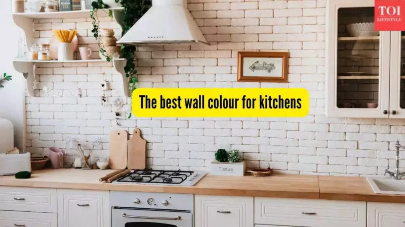
1. Timeless Whites and Off-Whites
Bright white remains a perennial favourite for its unparalleled ability to bounce light around a room, effectively making boundaries disappear for a spacious feel. However, pure white can sometimes feel too clinical. The solution is to choose softer variations like warm white or creamy off-whites. These tones retain the space-enhancing qualities while adding a layer of warmth and softness, making them ideal for compact kitchens.
2. Versatile and Warm Neutrals
Moving beyond white, the neutral family offers excellent options. Think light grey, warm beige, and soft taupe. These colours reflect light nearly as well as white but introduce more cosiness and depth to the kitchen. Their versatility is a major plus, as they complement both cool-toned stainless steel appliances and warm wooden cabinetry seamlessly.
3. Fresh and Calming Pastels
For those wanting a hint of colour without sacrificing spaciousness, pastels are a smart choice. Ramesh Singh, a Bengaluru-based interior professional, recommends light tones of blue, warm greens, and soft pastels like blush pink or pale aqua. "These tones maintain an open and spacious feel while elevating the kitchen's aesthetics," says Singh.
Specific pastel shades bring their own unique benefits:
- Pastel Blue: Evokes a breezy, calming effect reminiscent of the sky or water.
- Pale Green: Mimics natural light and brings a fresh, revitalising energy to the cooking space.
- Blush Pink: Acts as a modern, soft neutral that adds warmth while preserving an airy feel.
These subtle shades create an inviting ambiance, especially when paired with white cabinets or trim, which further amplifies brightness.
The Rising Trend: Soft Blues and Warm Greens
Currently trending in Indian homes are light blues and warm greens. These hues are light enough to reflect significant light, helping to visually expand the space by drawing the eye. More importantly, they instil a sense of calm and positivity—a perfect vibe for a room where meals are prepared with love and care.
If you're planning a kitchen makeover, start your journey with light neutrals and whites. Then, explore the soothing realm of soft blues and greens. Even warm, light yellows can be inviting. Remember, the core principle is to choose shades that maximise light reflection. This is the ultimate secret to achieving a kitchen that feels clean, bright, and wonderfully spacious.