
Indian Homes Embrace Warm, Layered Colors in 2026
Indian homes are undergoing a significant transformation, moving away from the long-standing dominance of sterile greys, high-gloss finishes, and stark whites. The year 2026 marks a clear shift towards colors that feel warmer, more layered, and authentically reflective of how people truly live. Walls are no longer mere blank canvases; they now play a crucial role in setting the mood, defining the rhythm, and narrating the story of a home. This year, ten specific colors are poised to redefine apartment walls across the country.
Kavya Sethi, Founder at Walnut Studio and Principal Designer at Woodcraft International, shares expert insights on utilizing these hues effectively to prevent small spaces from feeling cluttered. Her guidance emphasizes strategic application to enhance both aesthetics and functionality.
Clouded Cream: A Softer Alternative to White
Bid farewell to clinical white and welcome softer off-whites with a chalky, slightly warm tone. Clouded cream softly bounces light, making small rooms appear bright without the harshness of pure white. It serves as an excellent base for textured fabrics, wood tones, and woven accents, ideal for creating a calm background that allows furniture and art to stand out.

Cold Coffee Beige: Deep and Calming
Imagine a beige that is deep and serene, reminiscent of cold coffee. This color lacks yellow undertones but retains a subtle warmth, making it a superb choice for living rooms and bedrooms. It pairs beautifully with black or white accents and muted greens. Apply it on large walls and use furniture and metal details to introduce contrast.
Sandstone Nude: Bridging Warm and Cool
Sandstone is a versatile neutral that works exceptionally well in open-plan apartments, striking a balance between warm and cool tones. This sandy hue helps connected areas, such as the living room, kitchen, and dining nook, feel cohesive and part of a unified narrative. It complements terracotta, raw wood, and rattan to achieve a homely, earthy aesthetic.
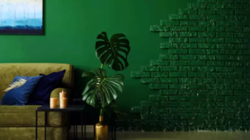
Deep Teal: Rich and Thoughtful
Teal takes on a more deliberate form: darker, richer, and more complex. In lounges or homes, deep teal can be employed as a statement wall that adds depth without overwhelming the space. It looks stunning alongside walnut furniture and brushed brass hardware, introducing a calm yet dramatic element.
Burgundy and Wine: Cozy and Soulful
Burgundy offers a warm, cozy sensation and enhances personalization, while wine evokes a more soulful and grounded feel rather than a theatrical one. These colors excel in dining rooms, reading corners, or behind headboards, creating a cocoon-like atmosphere. Balance them with lighter fabrics and soft lighting to maintain a light mood instead of a heavy one.
Olive and Sage Green: Nature-Inspired Calm
Muted greens address the urban desire for a connection to nature. Olive and sage promote calmness in bedrooms and reading nooks, while making kitchens feel cozy and lived-in. Combined with stone countertops, open shelving, and potted plants, these greens blur the boundaries between indoor and outdoor spaces.
Chocolate Brown: Mature and Luxurious
Chocolate browns are making a comeback as a mature contrast, following a period dominated by pastel, faded browns. When used sparingly—on an accent wall, architectural panel, or recessed shelving—they add strength and depth without shrinking spaces. Paired with creams and textured linens, chocolate tones exude a well-thought-out and quietly luxurious vibe.
Soft Peach and Apricot Tones: Welcoming Glow
Peach is emerging as a top choice in 2026, with apricot and warm blush tones replacing sugary pastels. These colors thrive in warm light, creating a soft, golden atmosphere that is both inviting and flattering. They are perfect for small bedrooms or powder rooms where a gentle glow takes precedence over trendiness.
Clay and Earthy Blush: Sophisticated and Natural
Mineral blushes and clay pinks represent the new wave of pink hues. When paired with textured wallpapers, boucle upholstery, and terracotta accessories, they achieve a sophisticated and natural look. These colors infuse a human touch into modern minimalism.

Soft Blacks and Charcoal Greens: Sculptural Contrast
While 2026 leans towards soft tones, dark colors remain important through precise application. Charcoal greens and softened blacks act as sculptural elements, creating contrast and depth in architectural features like niche panels, bathroom tiles, and kitchen backsplashes. Used in small doses, they impart a designer touch to compact apartments.
The Vital Role of Lighting
Lighting is crucial in color selection for any space. There is a growing preference for warmer light options in the 3000K-4000K range, which reveal textures and foster emotional warmth. Layered lighting—encompassing ambient, task, and accent types—enables colors to transition seamlessly from day to night without losing their character.
Moreover, the broader shift in these color trends is philosophical: individuals are increasingly choosing hues that evoke positive feelings at home, rather than those that merely photograph well or follow fleeting trends. Selection is based on compatibility with home decor, daily rituals, and longevity. In practice, start by defining the desired mood for each area, then select one primary wall color and two supporting colors for furniture or textiles. Test paint chips in the room at various times of day and employ warm lighting to preview the final effect.
In 2026, apartment walls transcend their basic function; they actively contribute to setting life's mood with softer, richer, and more personal colors than the standard palettes of the past. Choose colors that narrate your unique story, layer them thoughtfully, and let lighting serve as the transformative finishing touch.