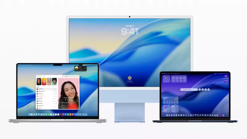
Apple's latest macOS Tahoe update is facing sharp criticism from design experts and software engineers for a fundamental flaw in its user interface. The controversy centres on the operating system's approach to menu icons, a practice that directly contradicts the company's own decades-old design principles.
Violating a Three-Decade-Old Golden Rule
Software engineer Nikita Prokopov recently highlighted a glaring inconsistency in macOS Tahoe's design language. He pointed out that the new OS adds icons to nearly every menu item, a technique that Apple's own Macintosh Human Interface Guidelines from 1992 explicitly advised against. Prokopov shared a graphic from the vintage guideline document that starkly contrasted what Apple labelled an "ugly" menu—cluttered with icons for every item—versus a "good" menu with minimal in-menu icons.
He demonstrated that the current macOS Tahoe menus are a near-perfect replica of the example Apple condemned over thirty years ago. While modern screens boast significantly higher resolutions, making icons sharper, Prokopov argues the core usability problem remains unchanged. "The main function of an icon is to help you find what you are looking for faster. Perhaps counter-intuitively, adding an icon to everything is exactly the wrong thing to do," he explained in his blog.
Inconsistency and Confusion in Iconography
The issues with macOS Tahoe's interface extend beyond simple overuse. Prokopov's analysis reveals a troubling lack of consistency in how icons are applied across different applications. He notes that Apple uses five distinct icons to represent the simple action of creating something "New," depending on which app a user is in. This variation for a common task can slow down recognition and learning.
Furthermore, the engineer found instances where the same icon is used to represent two entirely different functions. A prime example is an icon that serves both for creating a note in the Notes app and for editing an address in the Contacts app. This kind of duplication can lead to user confusion, undermining the very purpose of visual cues.
A Call for Simpler, More Effective Design
In his detailed blog post, Prokopov included numerous examples and proposed practical improvements. He advocates for a more restrained approach, similar to one Microsoft employed in early Windows versions, where icons were reserved only for the most frequently used functions. He also suggests using colour coding strategically alongside a reduced icon set to enhance usability and visual hierarchy.
This criticism of menu design follows earlier backlash against the macOS Tahoe app icons themselves, which were widely panned as "terrible" and "objectively bad" when they were first unveiled in late 2023. The cumulative effect points to growing concern among power users and professionals about the direction of Apple's desktop software aesthetics and functionality.


