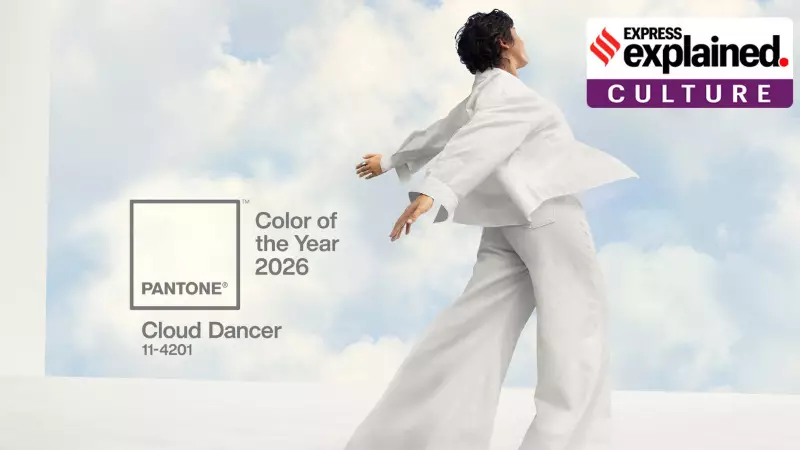
As December rolls in, the world anticipates cultural milestones, from Spotify Wrapped lists to annual reviews. Among these, one announcement consistently captures global attention across industries: the Pantone Colour of the Year. On Friday, December 5, the American colour authority unveiled "Cloud Dancer" as its predictive shade for 2026, describing it as a lofty white symbolising calm and quiet reflection in a chaotic society.
From Printing Shop to Global Colour Authority: The Pantone Story
Pantone's journey to becoming the world's definitive colour language began not in a design studio, but in a commercial printing company in 1950s New Jersey. Founded by brothers Mervin and Jesse Levine, the company's fate changed when Lawrence Herbert, a chemistry graduate from Hofstra University, joined as a part-time employee.
Herbert's scientific expertise allowed him to systematise the company's vast collection of pigments, simplifying coloured ink production. In 1962, he purchased the ink and printing division, renaming it Pantone. His groundbreaking work in standardisation ensured colours remained consistent under different lighting and conditions, a revolutionary concept at the time.
The following year, 1963, marked the birth of the Pantone Matching System (PMS). This system provided designers with physical guides—cardboard sheets with printed colour swatches—enabling precise colour matching from concept to production. This standardisation is why brands like Coca-Cola (Pantone 484) and Starbucks (Pantone 3298) maintain their iconic, universally recognisable hues.
Why Does Pantone Crown a Colour of the Year?
The tradition began in 2000 with the inaugural Colour of the Year: Cerulean Blue 15-4020. The selection is a year-long process conducted by the Pantone Color Institute. Teams comb the globe for colour influences, analysing trends in entertainment, art, fashion, design, travel, socio-economic conditions, and emerging lifestyles.
While there is a clear commercial rationale—promoting colour diversity and driving product collaborations, like the recent Motorola and Play-Doh partnerships for Cloud Dancer-themed items—the announcement resonates on a deeper level. Pantone states the program aims to teach companies and consumers about colour's psychological power and expressiveness, influencing both design strategy and personal identity.
The chosen colour often cascades through industries for years, appearing in home decor, consumer products, fashion, and media. A 2020 Business Insider report highlighted how the colour swiftly appears in everything from cookware and luggage to film palettes, thanks to strategic brand agreements.
The Cloud Dancer Debate: Minimalism or Lack of Inspiration?
The announcement of Cloud Dancer has, as with many previous choices, sparked conversation. While many praise its classic, minimalistic, and calming aesthetic, others criticise it as uninspired and lacking energy. In the politically charged climate of the US, some have even tenuously linked its white-ish hue to broader societal conversations.
This divisive reaction, however, underscores the very purpose of the exercise. Pantone's choice provides a literal and figurative blank canvas, inviting individuals and industries to project their interpretations, aspirations, and critiques. It transforms colour from a mere visual element into a barometer of the cultural mood, proving that in a world of complex data, the language of colour remains powerfully subjective and universally compelling.